Nonprofit Dashboard
A Clear, Approachable Method for Admin to View and Manage their Org's Data
Objective:
Design a responsive dashboard for a
nonprofit, so they can view and manage
the organization's data in house
Roles:
UX Researcher
UX/UI Designer
Testing Facilitator
Duration:
2 Weeks
(80 Hours)
Tools:
Dribbble
Figma
Google Suite
Zoom
What's the problem
A nonprofit needs to be able to view and manage the organizations information
Who are we solving this for?
Admin staff of a nonprofit organization that runs on donations
Why is it necessary?
The nonprofit does not want to download an outside app to manage all this important information, so they need it accessible within their website
How will the solution help?
A responsive dashboard that allows admin to find important info at a glance, view analytics, keep track of all donations, manage tasks, and more
Conducting Secondary Research
Because the product that I was designing was to be used by a sole client rather than out on the market, I opted for focusing on secondary research rather than a competitive analysis
This put me in a great position to soak up information about dashboards and nonprofits
As a result, I discovered dashboard standards, what kinds of formats, analytical lay outs, and components were most beneficial, and more about nonprofits and the kinds of information they handle
Compiling Design Patterns
I compiled images from Dribbble of dashboards that looked strong, aesthetic, and useful as well as specific components and features I was interested in including onto an inspo board
Became super easy to glance at for inspiration or answering questions when sketching lofi’s or making UI components
Creating a Persona
I created 1 persona to represent our users
Due to the nature of the brief, the user base was already narrowed down quite a bit to “non profit administrative users”
Through the persona, I was able to better imagine the needs and pain points of the user through a more realistic and empathetic approach
Drawing a Storyboard
Storyboarding is a really important piece of my process
It pinpoints the main issues I’m trying to solve and makes the design process much more human centered - reminding us that there are real people behind the screens we design for them to use
It also makes sure I am actually solving the issues at hand with my design
Feature List
Before getting started with any design, I made sure to have a clear list of all the possible features and group them into levels of priority, as follows...
- Must have
- Nice to have
- Surprising and delightful
- Can come later
User and Task Flows
I started by making user and task flows since I felt like dashboards would be more specific, short tasks-based rather than website exploration-based
When working on user flows, I realized a way to map out the primary/secondary/tertiary navigation would be more useful, so took a step back and made a….
Site Map
Although fairly simple in appearance, the dashboard sitemap helped lay out which features and pages would be placed where as well as how to get to them
Since there aren’t so many levels of navigation and pages in dashboards, this wasn’t something I originally thought I needed, but making it before I started designing wireframes after all was the best choice to make at this point
At this point, I wanted to pause and make sure nothing was missed and everything that I did in the research, define, and mapping out phases of my process was clear, organized, and easily accessible in one place
This also gave me the opportunity to once again look at the brief to remind myself of important points like the main goals, focus, and scope of the capstone project
Alright, deep breath… let’s go!
Lofi Wireframes (Desktop, Tablet, Mobile)
Midfi Wireframes (Desktop)
Midfi Wireframes (Tablet, Mobile)
Hifi Wireframes (Desktop)
Preparing the Prototype
The first step was actually making the prototype by creating all the additional necessary screens for the task and linking them together with hotspots
During this project, I played around with using hovering states to elevate my prototype and make it feel more like a usable website and less like a test run
The primary navbar was completely enabled for users to test the general navigation and explore the other pages
The task users were asked to complete:
“You want to send a thank you note in the mail to the most recent donor. Find their details through the Donor Card at the top.”
First PrototypeGroup Critique Tests
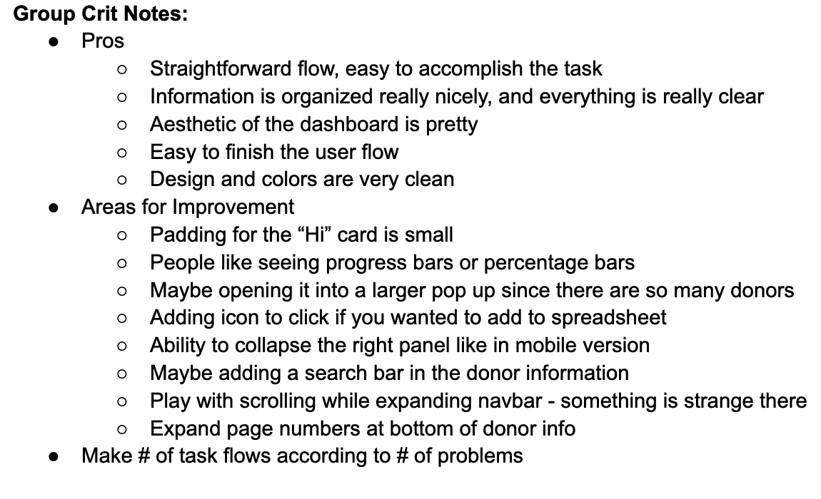
In Designlab’s program, we are given the opportunity to meet with other students weekly, present work, and give/receive feedback. During the second week of this project, I presented my prototype and received detailed feedback from 5 other students with compliments, suggestions/critique, and questions.
Individual Usability Tests
I also made sure to test my prototype with two individuals, so that I could
view their thinking process as they shared their screen and navigated the prototype. These participants tested a
slightly reiterated version of the prototype with some changes based on the group crit session. Doing these individual tests gave the time to provide them with a to get more
feedback on specific aspects.
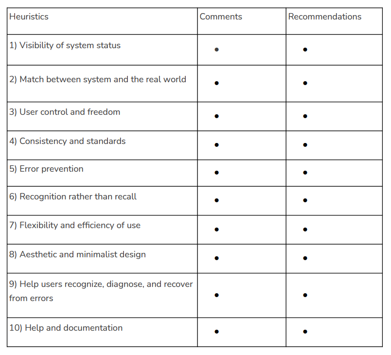
Prototype Analysis
After all that testing, I compiled the data and heuristics forms into
one document that
organized the notes I took during group crit and individual testing into a table of 4 categories:
- Worked
- Change
- Questions
- Ideas
This helped
guide my reiterations by revealing what worked well and should be kept, changes that needed to be made, questions that users may have about the usability, and potential ideas to consider integrating into the design

As advised by a student in group crit, I increased the padding between the text and box by decreasing the size of the text of the welcome message and centering it a bit more
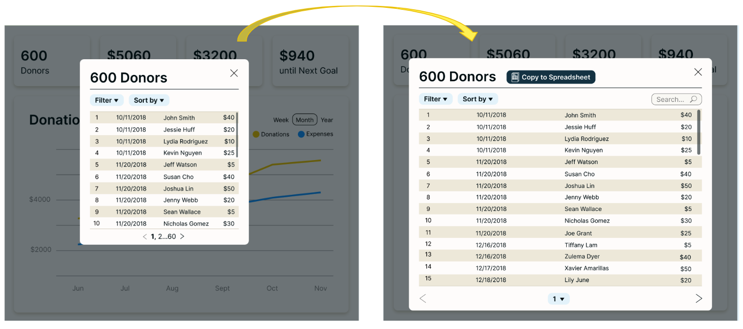
The changes made here include an increased the size of the pop up, an added “Copy to Spreadsheet” button so that users can transfer the info over, an added “Search” bar for those who already know the name they’re looking for, and an altered format of navigating pages to suit the amount of pages better with a drop down as well as arrows
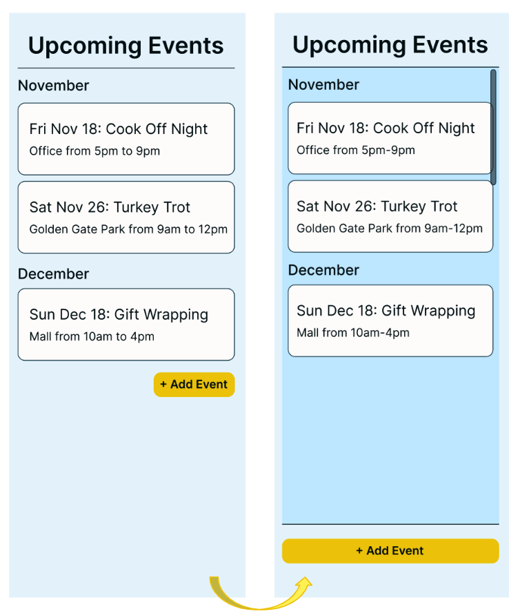
My mentor advised me to edit the calendar page to prevent the “Add Event” button from getting lost under many event cards, but rather always be visible to the user by either
1) Putting it at the top
2) Making the event cards encompassed in a scrollable section with the button sitting below that section
I chose 2 because I felt that it made more sense hierarchically to view already published events and the “Add Event” button after
Reflection
This capstone was a really fascinating project that allowed me to learn about...
- How organizations view, organize, and use data
- How to approach designing a dashboard
- What potential features and pages organizations would want to have available to them
- Designing features such as graphs, tables, and lists
- Hover states in prototype and making the navbar have more points of interest
Next Steps
If I were to continue this project, I would…
- Create more task flows for trying out features such as the main graph or task list
- Add more tidbits of info (ex: % increase) to the basic # cards at the top to differentiate them and provide more info at a glance
- Review the language used in the prototype, and explore clearer options


.png)


